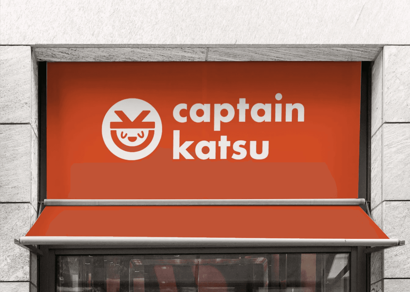
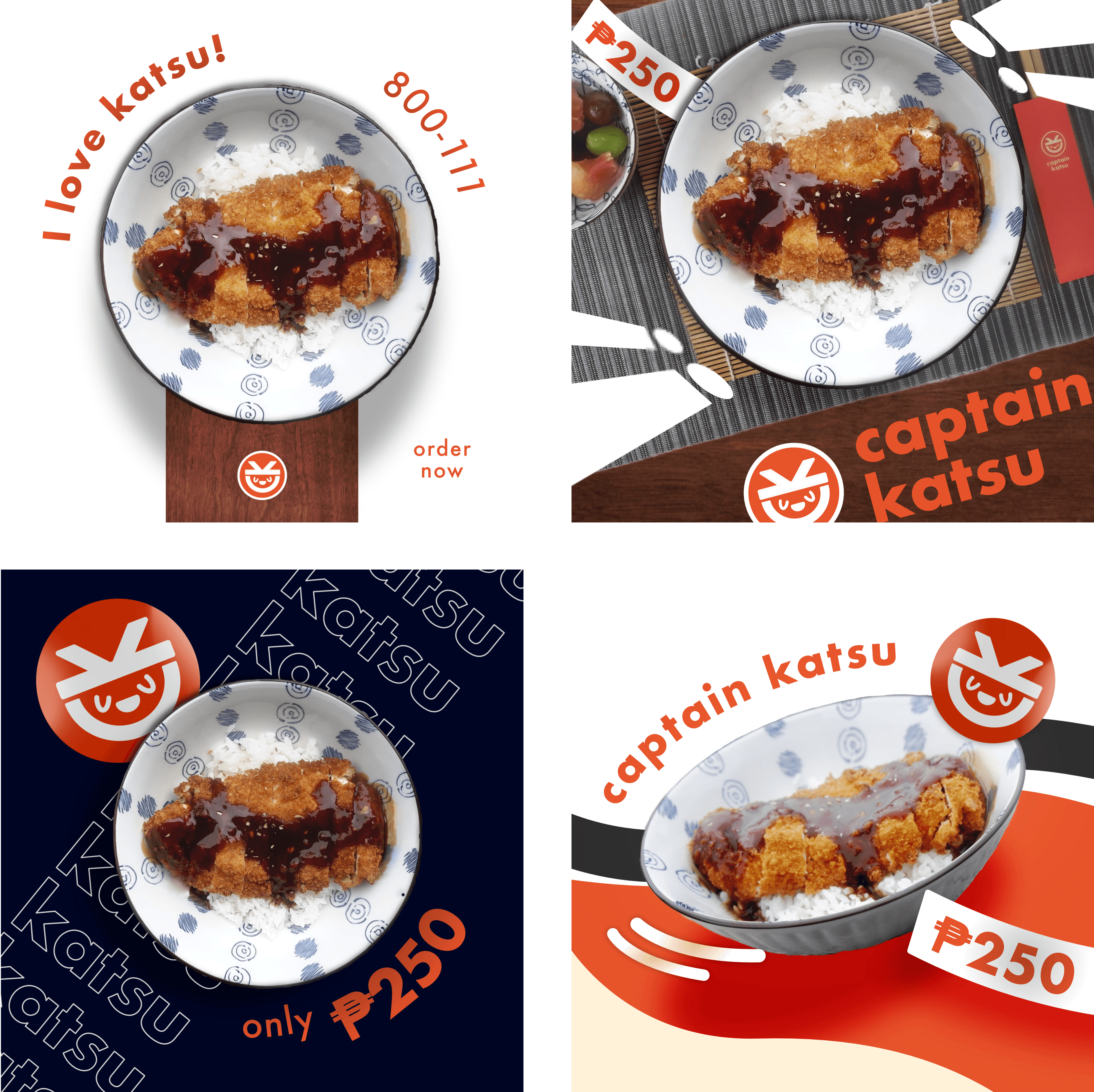
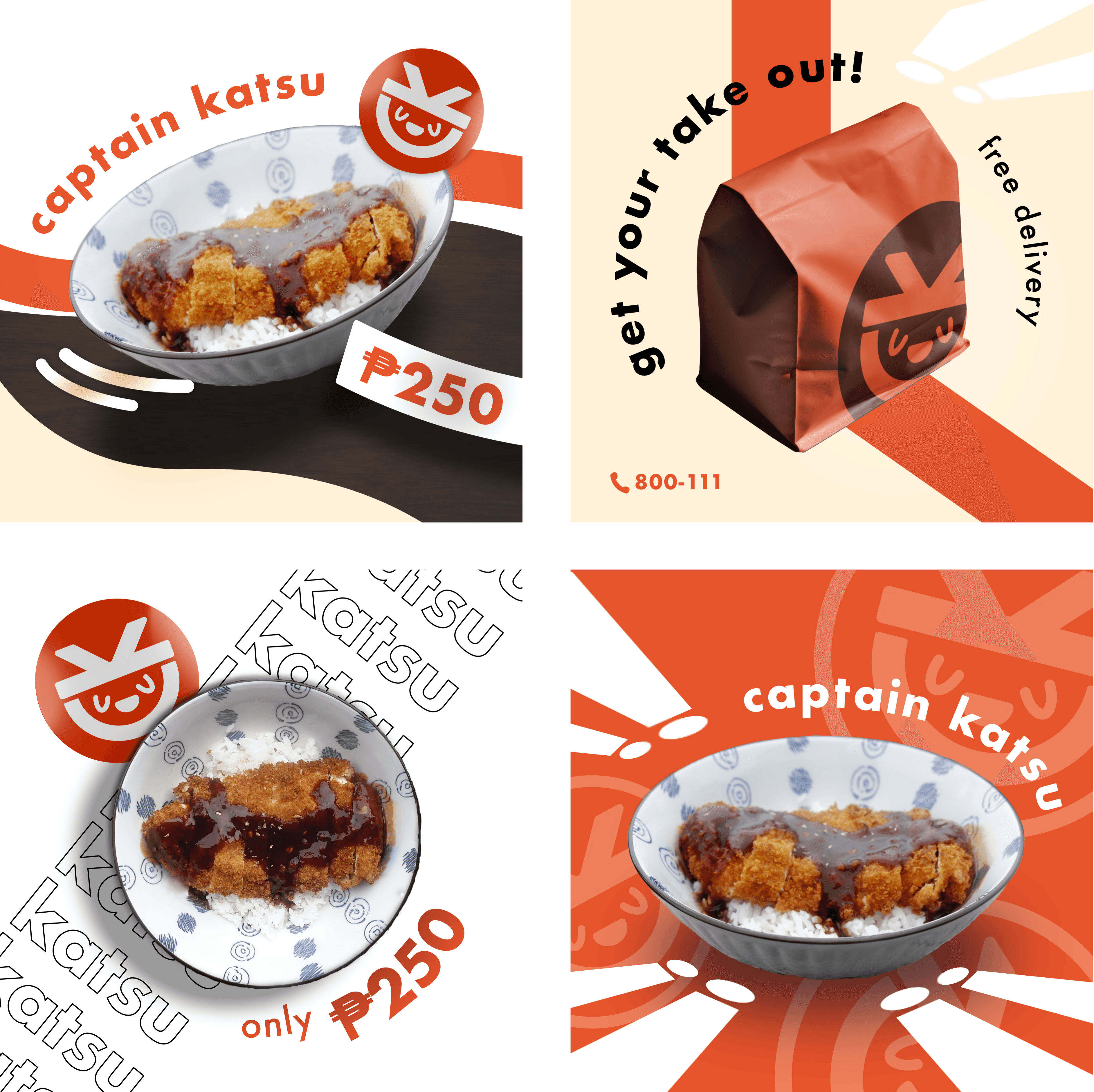
Captain Katsu
Overview
The Captain Katsu project focuses on creating a vibrant brand identity for a comfort food restaurant specializing in Japanese katsu dishes. The visual identity was carefully crafted to capture appetizing appeal and a fun, casual dining experience that resonates with the newer generations.

Design Process
The idea was to integrate bold minimalism which involves high-impact, contrasting, and clean elements. Despite the negative space, there is still a confident approach for the modern and intention visuals.
Colors — The red was bold, which also worked with the consumer-psychology of how red is already associated with Japanese restaurants (Kimpura, Ramen-nagi, Ichiran). In other words, there is no need to reinvent the wheel. The black adds contrast and sophistication, while the white space maintains cleanliness and modernity throughout the branding materials.
Fonts — A friendly, bold sans-serif font is used for the logo and headers to communicate approachability and energy. The rounded edges of the typeface complement the soft, playful character of the mascot logo, while simpler sans-serif fonts were used for body text and promotional copy to ensure clear readability.
Layout — The layout balances visual energy with clarity, placing key elements such as the logo, product images, and pricing in focal positions. Circular motifs are repeated in product shots and logo applications, creating cohesion and dynamism. The minimalistic but bold presentation highlights the food prominently, making the dishes the star of each promotion.
Another practical train of thought was that the visuals shouldn’t overpower the actual food product, but complement.

Software
Affinity Designer
Slideshow: https://tinyurl.com/captainkatsu
Note: Captain Katsu is a passion project, since I had a mild obsession with Japanese cuisine.
