hillary
Home
Archives
Previous service
Next case study
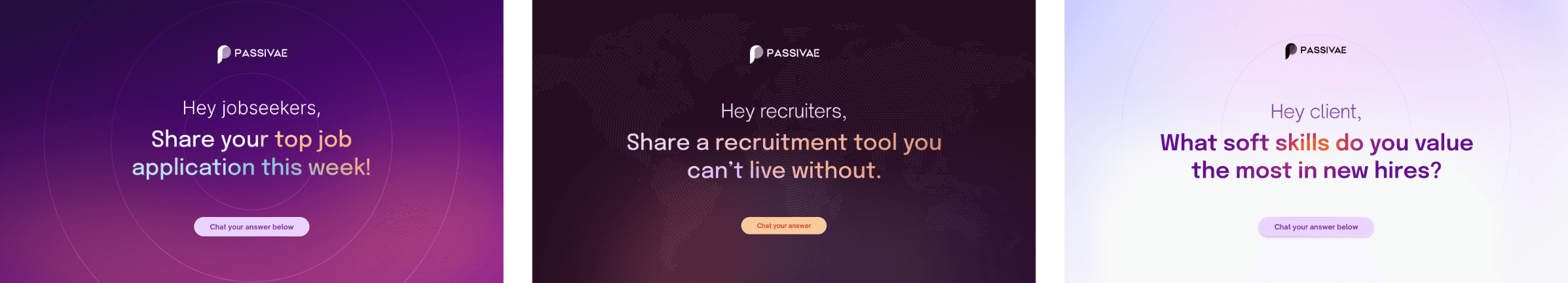
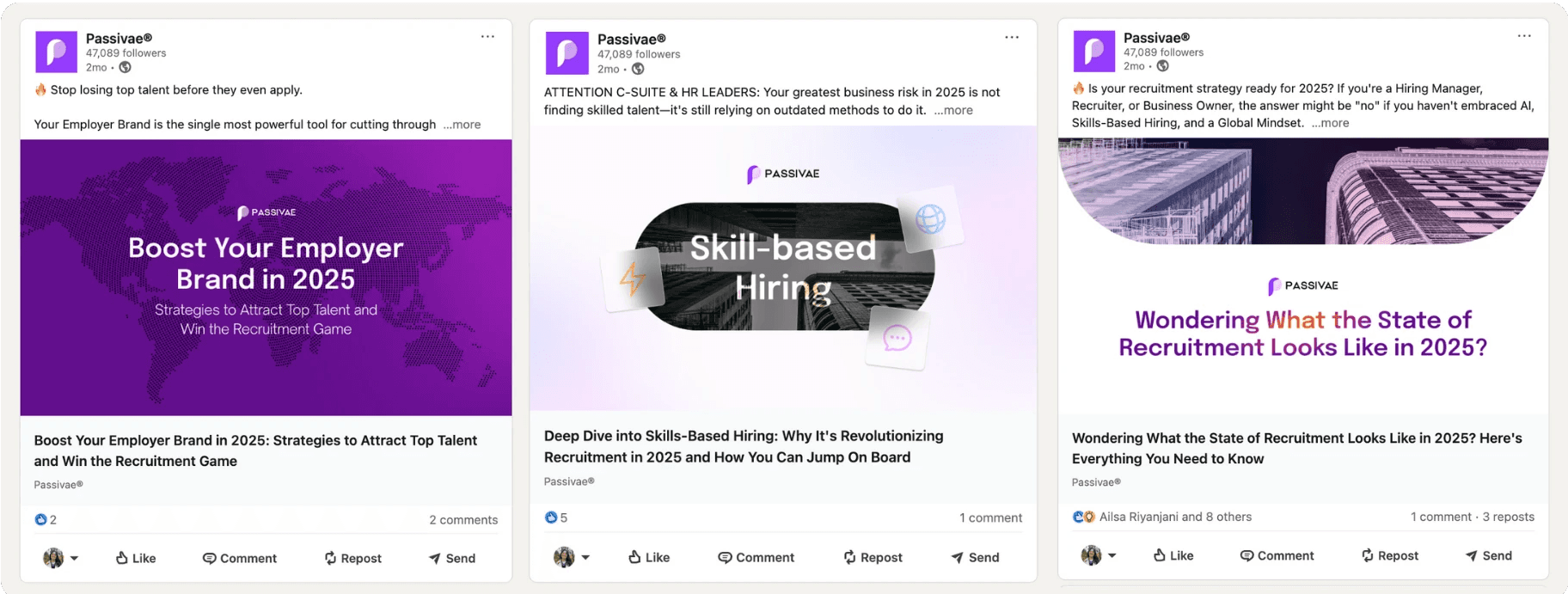
If LinkedIn and Upwork had a baby.—Shay Ijaz, Founder & CEO
I'd love to connect with you! Then we can get started on collaborating and start cooking designs together.
Let's go!
Remix for Free
Create a free website with Framer, the website builder loved by startups, designers and agencies.